DQ®

Portfolio system / Proposed direction

Review components

01 / Modern Swiss

Systems become visible when structure becomes the image.

A typographic architecture for portfolio evidence: flat planes, hard rules, compressed type, and color used as wayfinding rather than decoration.

Explore system
01

Type as structure

02

Color as place

03

Zero decorative depth

Foundational elements / Proposed tokens

The decisions behind the surface.

Proposed translation of The1’s Modern Swiss language; normalized values, not a source-code extraction.

01

Color palette

Semantic roles, usage and minimum contrast.

Canvascanvas.default
#D2D2D2Primary field
Ink 9.49:1 · AAA
Inktext.primary
#2A2A2AText + hard rules
Canvas 9.49:1 · AAA
Orangebrand.primary
#E68442Primary action
Ink 5.29:1 · AA
Redstatus.error
#B42318Error only
Canvas 4.35:1 · AA large

Rule: body text targets WCAG AA 4.5:1; large text 3:1; focus and component boundaries 3:1. Status never relies on color alone.
02

Typography scale

Family, weight, size, leading and tracking.

RoleFamily / weightSize / lineTracking
DisplayArial Narrow → Inter fallback60096–140px0.78−0.075em
H2Arial Narrow60056–76px0.88−0.05em
BodyInter40016–20px1.550
LabelJetBrains Mono50011px1.4+0.10em
03

Spacing & layout

4px base scale with bounded responsive decisions.

0px 4px 8px 12px 16px 24px 32px 48px 64px 96px 128px
Grid
12 columns
Gutter
24px desktop / 16px mobile
Page padding
64px → 18px
Max width
1500px
Section gap
128–168px
04

Assets & motion

One visual vocabulary and one response grammar.

Icons
1.5px outline, square optical box, no filled mix
Logo
Ink-only; preserve 1× cap-height clear space
Images
Full-bleed crops; no decorative radius
Illustration
Flat geometric planes; max three system colors
Hover
120ms · ease-out
Press
scale .96 · 120ms
Enter
No default page entrance
Reduced
All transforms and fades disabled

Component stress test

One system, every state.

Visible state inventory, exact geometry and equivalent content across all five directions.

Control height46 / 52px
Control padding0 × 18px
Panel padding44px desktop / 24px mobile
Radius0px panel / pill control

01 / Button

Action hierarchy

PrimarySecondaryQuietHoverFocusPressedDisabledLoading

02 / Text field

Every validation state

Use dots instead of spaces.

03 / Disclosure

Rules stay close

Why is this component shared?

It expresses the same intent in repeated, accepted use and preserves keyboard behavior without custom state.

What stays local?

Project evidence, brand treatments, and one-off narrative compositions remain locally scoped.

04 / Card resilience

Content cannot break it

With imageInterface ecology
No imageStrategy and governance

Supports a text-only evidence path.

Long titleCross-platform interaction architecture for adaptive mobility environments
中文适配本田跨平台智能座舱设计系统

Patterns & implementation

Components only matter in relationships.

Navigation, modal behavior and code mapping remain shared while visual tokens change by direction.

Navigation pattern

Persistent orientation

Brand left, current section centered, one next action right. At mobile widths the context label collapses before the action.

header → nav landmark → current page → primary destination

Modal pattern

Focus stays contained

Open from an explicit trigger, focus the title or first field, close on Escape, restore focus to the trigger, and block background scroll.

Dialog.Root + Overlay + Content + Close

Code mapping

Semantic tokens in code

.projectCard {
  padding: var(--space-6);
  color: var(--text-primary);
  background: var(--surface-raised);
  border-radius: var(--radius-panel);
}
320px viewportSingle column · no horizontal page overflow
200% textContent reflows · controls keep visible labels
Reduced motionStatic final frame · no transform or fade
KeyboardVisible focus · native disclosure behavior

Real content test

A project card has to carry evidence—not just look composed.

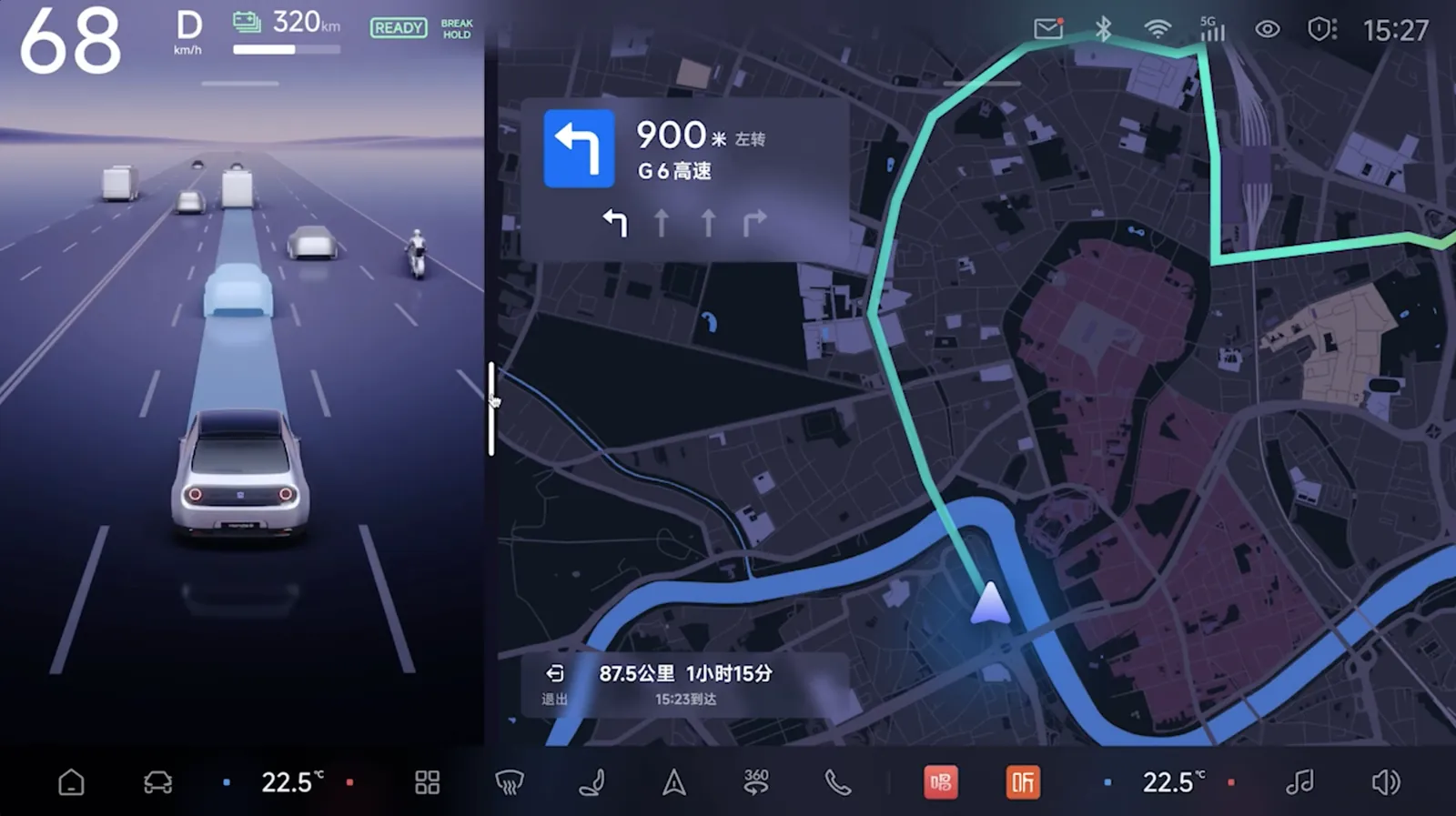
Honda HMI Design System interface overview
Published work

Professional project · 2024

Honda HMI Design System

A scalable HMI design system connecting brand language, interaction rules, reusable components, and adaptive delivery across mobile and in-vehicle products.

Design systemsHMICross-platform
Scope
Mobile + HMI
System
3 token layers
Library
20+ components
Read case study

Proposed direction · isolated from production

Use 1–5 or ← → to compare · R to replay