Evidence, not decoration.
Project imagery and content lead. Use large type, whitespace and differences in scale to organize information rather than putting everything into identical cards.
Starting from Deethin’s actual homepage and Fabrica’s editorial rhythm, turn visual, spatial and motion decisions into rules that can be inspected, reused and discussed.
Inspect working componentsV1 remains a historical comparison. At the owner’s request, content below the homepage hero and the Portfolio review page now use shared tokens; project cards use the working component below. New homepage compositions retain source and review status, without claiming approved Figma assets. Other pages have not undergone a site-wide style migration.
Project imagery and content lead. Use large type, whitespace and differences in scale to organize information rather than putting everything into identical cards.
Sections have an editorial rhythm. Components have explicit padding, gap, state and accessibility rules. Keep those two densities distinct.
Keep the homepage’s narrative opening; controls respond immediately. Motion must not obstruct reading, keyboard access or reduced-motion users.
Primary #FFFFFF is the base, Secondary #101010 the contrast, Accent #73D1F8 the brand highlight. 60–30–10 guides composition, not a per-screen pixel quota or a requirement for white primary buttons. Surface / Ink describe purposes and may reference the same primitive.
#ffffff--ds-surfaceProjects, inputs & dialogs
Deethin source#101010--ds-inkBody text, primary buttons and dark chapters; compositional Secondary
Deethin source / owner direction#73d1f8--ds-accentMain logo color, occasional highlights and dark-surface data labels; not small white-background text
Owner direction#f4f4f2--ds-canvasPage background
Deethin source#1d1d1d--ds-surface-darkDark-gray evidence cards inside black sections, avoiding excessive contrast from white cards
Deethin .caseEvidence#0087fb--ds-accent-inkMONO data labels on light surfaces; does not replace the logo’s #73D1F8
Owner directionGray descriptions keep the text/muted role, not Secondary. State colors are not shown in this palette. Controls temporarily retain V1 functional colors for later Figma verification, without unilateral replacement.
oklch(.18 .02 255)oklch(.53 .2 263)oklch(.81 .108 234)oklch(.955 .022 226)oklch(.985 .008 235)The full band uses the homepage CSS fallback recipe: 165° / 48% / 62%. The five swatches below come from smoke-renderer.ts’s light-field palette. These are different algorithms. Figma can start from a static keyframe or gradient approximation; copying five colors does not reproduce the moving field.
JetBrains Mono · 12px / 500 / 1.6 / .04em. Use #73D1F8 on dark surfaces and the iteration’s #0087FB on white. Its white-background contrast is 3.58:1, below the 4.5:1 small-text threshold. This remains a Proposed data label; essential information needs darker color or larger/heavier type. Explanatory paragraphs use sans and neutral gray.
Inter / system sans handles content; JetBrains Mono handles code and measurements. Reuse existing site fonts without additional requests. Semantic hierarchy and visual size are separate.
clamp(3rem, 7.5vw, 7rem) · 600
line 0.96 · tracking -.055em
Short English display headings only, not body text
clamp(2.5rem, 5vw, 4.5rem) · 600
line 1.04 · tracking -.04em
Page title; one semantic h 1 per page
clamp(2rem, 3.8vw, 3.5rem) · 600
line 1.1 · tracking -.035em
Section headings
1.5rem · 600
line 1.25 · tracking -.02em
Component and project titles; wrapping allowed
1.25rem · 600
line 1.35 · tracking -.01em
Subsection headings
1rem · 600
line 1.5 · tracking 0
Group headings
.875rem · 600
line 1.5 · tracking 0
Detailed headings; avoid deep nesting
1rem · 400
line 1.7 · tracking 0
English/Chinese explanations; max 65ch; Chinese line-height 1.8
.875rem · 500
line 1.4 · tracking 0
Button and form labels; not all uppercase
.75rem · 400
line 1.6 · tracking 0
Notes; values use JetBrains Mono and do not carry the core explanation
Tight tracking is for English headings only. Chinese headings restore normal tracking /1.25 leading; Chinese body leading is 1.8. Essential information must not use tiny labels.
space-00pxspace-14pxspace-28pxspace-312pxspace-416pxspace-520pxspace-624pxspace-832pxspace-1248pxspace-1664pxspace-2496pxspace-32128pxEach item has a local diagram. Thumbnails show relationships rather than squeezing a 1440px page into a card. Controls keep actual box-model dimensions; the full responsive grid appears below.
max 1440px16–40pxclamp(16px, 3vw, 40px), with content capped at 1440px. Do not scale the entire page.
64–128pxclamp(64px, 8vw, 128px). Distinguish editorial whitespace from compact spacing inside controls.
12 col6 col1 col12 → 6 → 112 columns at ≥1200px, 6 at 700–1199px, and one below 700px. The demonstration grid responds to width.
gap 8 · cover 4:32 → 1Two columns at ≥700px with 8px gap; one below 700px. V2 covers are 4:3, titles stay visible, and supporting tags follow interaction state.
↕12 / ↔20 / gap848 / 20 / 8Buttons: min-height 48px, padding 12px 20px, icon–text gap 8px. Long labels can wrap and increase height.
← max 65ch →Let text breathe.
Read information in order.
Line-height 1.8 without shrinking type.
65chLong text uses one column; Chinese line-height is 1.8. Mono is for values, not whole explanatory paragraphs.
320pxAa200%Aa320px / 200%Navigation wraps, tables stack and dialogs scroll. Do not conceal overflow to imitate responsiveness.
This button uses the same class and tokens as the state library; it is not a separate box-model drawing. Controls have a minimum height rather than a fixed height that clips enlarged text.
A gray base supports white cards. Black cards provide section contrast; blue cards are occasional emphasis, not a replacement for all backgrounds.
A black base supports #1D1D1D cards. White is primarily text; accent is reserved for occasional MONO labels.
8pxSmall precise controls: inputs, menus and parameter panels. Cleaner edges avoid making every control look like a large card.
18pxMedium content containers: project cover plus title, and dark-gray evidence cards. Radius groups content; it does not imply clickability.
28pxLarge chapters or separate stages: a clearer spatial boundary with the page, not a radius applied to every inner element.
pillButton height determines the pill. Its action shape does not compete with card radii. Coordinate nested radii with padding; do not blindly nest 18 inside 18.
Elevation suggests floating above the page through shadow. z-index is overlap order, not shadow size or Figma depth. Static cards use light/dark surfaces, not shadows. Dialogs use two shadow layers; content 0 / sticky 20 / toast 40 is a local stacking convention. Native dialogs use the browser top layer, which is not equivalent to a larger z-index.
These are comparable visual-state samples: hover / focus / pressed are held visibly. Use the demonstration below for real interaction. Disabled and loading controls cannot trigger repeatedly.
Preserve focus and minimum width; return feedback after 900ms.
Focus is not removable decoration: Tab users and external keyboards on touch devices need location feedback. Inputs may share a dark boundary with hover, but focus-visible adds a thin 2px ring. Pointer buttons do not keep a heavy ring. Browsers may show focus on active text inputs; this is intentional.
Label→input 8px; input padding 12×16px / min-height 48px; helper gap 8px; font-size 16px prevents iOS focus zoom. Disabled and read-only are not equivalent.
REST / hover or focus with Tab
REVEALED / supporting information held visible
Covers increase to 4:3; body copy contains project type, year and title. White tags and arrow share a row at the cover bottom, revealed on hover / focus and visible on touch. Titles wrap; at 200% text size, supporting information returns to document flow rather than covering the image.
Page colors, 18px project radius, 16:9 covers and editorial motion are traceable to Deethin source. State colors, the full type scale, control dimensions and interaction additions are Proposed. Extracted Fabrica data stays separate and does not automatically replace semantic tokens.
Homepage, case studies and experimental components have different responsibilities. Confirm direction 6 first, then migrate components individually and check their states and content. Experimental values must not silently become site-wide rules.
The complex homepage opening stays in the production page. This separate stage tests the same editorial rhythm without replaying the entire WebGL opening.
Hover icon translate(3px,−3px) over 320ms; reverse on leave. Press scales to.98; keyboard location feedback is immediate.
Hover underline scaleX(0→1) over 240ms, from the left. Focus reveals it immediately; touch always shows the line.
Reuse the real ProjectCard above: image 800ms, tags 240ms, arrow 500ms. Only supporting information changes; the title and entry remain visible.
Click to replay translateY(110%→0) over 1050ms (.16,1,.3,1). No looping or reading delay. Reduced motion shows it immediately.
Click to replay opacity + translateY(16px→0),240ms with 70ms stagger. Explain reading order without animating size or blur.
Hover changes the background; pointer press scales to .98; keyboard focus is immediate. Leaving or releasing returns smoothly to rest.
Click-to-replay stage only: opacity 0→1, translateY 24→0, stagger 70ms. Content is visible by default, with no scroll gate.
Fine-pointer hover scales imagery 1→1.04. Keyboard focus reveals supporting information immediately; touch access does not depend on hover.
This iteration uses native details and dialog. Do not imply unimplemented height or exit animations. Escape closes the dialog and restores trigger focus.
The save demonstration delays for 900ms, exposes aria-busy, prevents repeat triggers and announces completion as status text. Local only; no data is sent.
Either the system preference or the page switch disables animations, transforms and transitions. Save status remains visible; the spinner is not the only feedback.
This is a component stress sample, not a full-page browser-zoom test. Also inspect navigation and layout in an actual 320px viewport.
Clear filters to view existing work. This is an empty-state sample, not the actual project list.
The catalogue and Figma assets are not synchronized live. Existing rules, deployed homepage source and pending additions are separated so a rendered value does not automatically count as approved.
Deployed CSS from www.deethin.site has been compared with local production source. The hero retains its design; compositions below it, project cards, the Portfolio review page and this catalogue share one token entry point. Sources and pending status remain explicit; added values are not automatically Figma-approved.
fabrica.module.css / .caseSection · .caseEvidenceBlack chapter / dark-gray cards / 4 → 2 → 1 columns /18px radius
Dark surfaces composed with evidence; not a universal page dark mode
View homepage compositionsfabrica.module.css / .contactSection · .contactStoryPaired dark/light surfaces /24px panel /28px padding / separate form
Complete Contact composition; controls reuse the catalogue’s form and button
View homepage compositionsFabricaMotion.tsx + fabrica.module.css:699–717800/950ms ·40px travel ·7px blur · one entrance
Reveal each group on scroll; visible by default and immediate with reduced motion
View homepage compositionsHeroExperience.tsx / smoke-renderer.tsWebGL light field / opening timeline / static fallback
Existing Hero analysis is retained; fallback does not prove complete interaction reproduction
View homepage compositionsA deployed bilingual portfolio portal, with historical versions retained for comparison and recovery
A source-led path from an Obsidian factual master to bilingual modules and project pages
A bounded Codex → WorkBuddy task with explicit evidence, acceptance criteria, and return material
A reviewable pilot spanning the local Design System V2, Figma Inuse assets, and a representative page
Tell me about the product, the difficult part, and what a useful outcome would look like.
--home-evidence-canvas#0d0d0d--home-evidence-cardvar(--ds-surface-dark)--home-evidence-textvar(--ds-surface)--home-evidence-muted#aaaaaa--home-evidence-label#8a8a86--home-evidence-radiusvar(--ds-radius-panel)--home-evidence-card-radiusvar(--ds-radius-card)--home-evidence-card-padding22px--home-evidence-card-height200px--home-evidence-card-gapvar(--ds-space-2)--home-evidence-title-sizevar(--ds-type-h3)--home-evidence-title-leading1.15--home-evidence-title-gap50px--home-contact-canvas#111111--home-contact-muted#b2b2ae--home-contact-radiusvar(--ds-space-6)--home-contact-paddingvar(--ds-radius-panel)--home-contact-title-leading.9--home-contact-title-tracking-.07em--home-contact-title-sizeclamp(76px,10vw,140px)Sources: the 2026-10-04 binding manifest and 2026-09-27 foundation audit. Light / Inverse are usage contexts, not automatic modes. The older Semantic-Colors / Component-colors variable manifest below is a historical proposal, not current Figma assets.
Content remains readable; fine-pointer hover shows the existing Overlay/Modal shadow at the owner’s request, without new shadow colors.
The light-blue supporting surface was withdrawn in the owner’s latest feedback and is no longer available. Buttons, muted text and focus reuse the catalogue. Unconfirmed mappings and compositions are listed separately. Figma was not reread this iteration because of tool-call limits; that is not evidence of missing assets.
primary-ctavar(--ds-ink)Existing component reusedV2 / .buttonRestore the black pill primary button; no custom large blue panel
muted-textvar(--ds-muted)Existing web token / Figma mapping pendingV2 tokens.ts / mutedAn existing web role; live Figma Paint Style has not been verified
focusvar(--ds-focus)Existing web token / Figma mapping pendingV2 tokens.ts / focus; Figma also has propose/System/Focus/LightReuse the catalogue focus ring without claiming different values match
mono-strong700Pending / not usedPrevious candidatePage uses Data/Label 500 again;700 remains pending and unused
closing-24var(--ds-type-h3)Existing size / role pendingV2 / H3 24pxSize exists; closing-text role still needs confirmation
responsive-typevar(--ds-type-h1) / var(--ds-type-h2)Existing interpolationV2 / typeScaleRemove ch limits in both languages; restore Chinese leading 1.25 per catalogue
breakpoints900 / 640 / 400pxPendingPrevious candidateGenerate media rules from this registry
gallery-widthmin(85%, 48rem)PendingOwner requested galleriesBoth galleries share width; do not limit text lines
bottom-blur112px / 4,8,16pxPendingPrevious candidateKeep bottom blur isolated; not an approved Figma Effect Style
scroll-choreography800ms / 950ms / 40px / 7pxProduction-source pattern / Pending adoptionFabricaMotion.tsx / fabrica.module.css:699Group entrances; reduced motion and keyboard location show content immediately
The homepage, current Portfolio review page and this catalogue use the same portfolioTokens object. These additions record existing homepage values; they do not imply Figma synchronization or new approval.
Single row at every width; native horizontal scroll when needed; no visible heading.
4:3 media, project metadata and title; reveal tags and arrow on hover or focus, visible on touch.
Each card fills a complete row at every width; thumbnail, localized title and summary retain their shared heading and surface roles.
One movable title per item, images, description and tags; no repeated title or category caption. Owner-requested 650ms ease-in-out layout transition; reduced motion remains immediate.
Existing inverse composition, cards and form consume shared semantic tokens.
One site footer per route; localized navigation points back to homepage sections.
 Codex (ChatGPT)
Coding agent
 Claude Code
Coding agent
 Relume
Sitemaps & wireframes
 Refero
Design references
Agent harness
 WorkBuddy
AI workspace
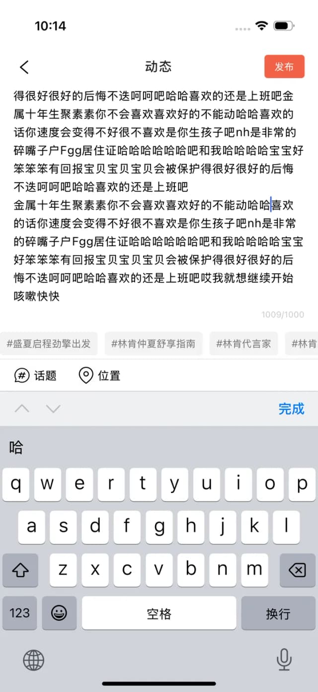
Mobile text-input rules defined by the task each piece of content performs.
A scalable HMI design system connecting brand language, interaction rules, reusable components, and adaptive delivery.
A scalable HMI design system connecting brand language, interaction rules, reusable components, and adaptive delivery.
A working portfolio, content system, and multi-AI workflow built to evolve without losing design intent.
--home-evidence-canvas#0d0d0d--home-evidence-cardvar(--ds-surface-dark)--home-evidence-textvar(--ds-surface)--home-evidence-muted#aaaaaa--home-evidence-label#8a8a86--home-evidence-radiusvar(--ds-radius-panel)--home-evidence-card-radiusvar(--ds-radius-card)--home-evidence-card-padding22px--home-evidence-card-height200px--home-evidence-card-gapvar(--ds-space-2)--home-evidence-title-sizevar(--ds-type-h3)--home-evidence-title-leading1.15--home-evidence-title-gap50px--home-contact-canvas#111111--home-contact-muted#b2b2ae--home-contact-radiusvar(--ds-space-6)--home-contact-paddingvar(--ds-radius-panel)--home-contact-title-leading.9--home-contact-title-tracking-.07em--home-contact-title-sizeclamp(76px,10vw,140px)--home-frame-inset6px--home-frame-inset-compactvar(--ds-space-1)--home-gutter30px--home-gutter-tablet22px--home-gutter-compactvar(--ds-space-4)--home-section-space138px--home-section-space-compact94px--home-displayclamp(84px,11.25vw,144px)--home-display-compactclamp(62px,19vw,112px)--home-display-leading.92--home-display-tracking-.06em--home-study-headingclamp(56px,7vw,92px)--home-study-heading-compactclamp(52px,17vw,76px)--home-headingclamp(50px,6vw,78px)--home-heading-compactclamp(42px,13vw,68px)--home-heading-leading1.08--home-heading-tracking-.055em--home-intro-size20px--home-intro-size-compact17px--home-copy-leading1.45--home-copy-measure560px--home-header-gap100px--home-header-gap-compact60px--home-heading-gap90px--home-heading-gap-compactvar(--ds-space-12)--home-study-space-start56px--home-study-space-end170px--home-study-space-end-compact110px--home-study-card-height220px--home-study-card-height-compact190px--home-study-thumb76px--home-study-thumb-compact68px--home-study-card-radius22px--home-study-titleclamp(20px,2.1vw,30px)--home-study-title-leading1.05--home-media-placeholder#dededb--home-services-canvas#0f0f0f--home-services-text#f8f8f5--home-inverse-linergb(255 255 255 / .18)--home-inverse-muted#aaaaaa--home-service-index#b1b1ad--home-inverse-control-linergb(255 255 255 / .25)--home-services-space-start110px--home-services-space-end90px--home-services-list-gap86px--home-services-list-gap-compact54px--home-service-height92px--home-service-height-compact76px--home-service-titleclamp(24px,3vw,40px)--home-service-title-compact21px--home-service-expanded-titlevar(--ds-type-h2)--home-service-inset24%--home-service-inset-compact72px--home-service-index-width62px--home-service-toggle46px--home-service-toggle-compact40px--home-service-fan-height160px--home-service-image-width112px--home-service-image-height84px--home-service-image-step44px--home-service-image-turn7deg--home-service-image-top20px--home-tag-padding-block9px--home-tag-padding-inline13px--home-wordmark-weight650--home-section-extended-space180px--home-case-titleclamp(44px,5vw,68px)--home-case-wordmarkclamp(66px,10vw,140px)--home-case-wordmark-compact18vw--home-case-heightmin(67vw,800px)--home-case-height-compact120vw--home-case-height-max-compact650px--home-case-overlaylinear-gradient(180deg,rgb(0 0 0 / .05),rgb(0 0 0 / .62))--home-case-media-inset-7%--home-case-media-height114%--home-case-media-scale1.05--home-case-media-travel5%--home-contact-height760px--home-contact-height-compact690px--home-contact-headingclamp(38px,4vw,58px)--home-contact-heading-gap96px--home-contact-form-gap7px--home-contact-textarea-height110px--home-contact-muted-note#999999--home-contact-borderrgb(255 255 255 / .2)--home-footer-statementclamp(32px,4vw,54px)--home-footer-statement-tracking-.045em--home-footer-emailclamp(24px,3vw,42px)--home-footer-wordmarkclamp(110px,20vw,270px)--home-footer-wordmark-compact26vw--home-footer-wordmark-leading.7--home-footer-wordmark-tracking-.085em--home-footer-titleclamp(20px,3vw,42px)--home-footer-label#92928f--home-footer-legal#888888--home-footer-columns-gap120px--home-footer-wordmark-gap160px--home-footer-columns-gap-compact86px--home-footer-wordmark-gap-compact110px--home-heading-reveal-duration1050ms--home-heading-reveal-easecubic-bezier(.16,1,.3,1)--home-heading-reveal-travel110%--home-study-hover-scale1.06--home-hover-travel3px--home-hover-duration320ms--project-media-ratio4 / 3--project-arrow-size52px--project-arrow-size-compact44px--project-media-hover-scale1.04--project-arrow-rest-scale.75--project-arrow-rest-turn-20deg--project-arrow-duration500ms--project-arrow-icon-size22px--project-tag-size11px--project-tag-padding6px 10px--project-tag-padding-compact5px 8px--home-tools-gapvar(--ds-space-8)--home-tools-paddingvar(--ds-space-6)--home-tools-item-widthvar(--ds-space-32)--home-capability-open-padding76px--home-capability-index-top36px--home-capability-toggle-topvar(--ds-space-6)--home-capability-index-top-compact30px--home-capability-toggle-top-compactvar(--ds-space-4)--home-blur-layer30--home-blur-mask-smalllinear-gradient(to bottom, transparent, rgb(0 0 0 / .12) 20%, black 62%)--home-blur-mask-mediumlinear-gradient(to bottom, transparent 25%, rgb(0 0 0 / .15) 48%, black 82%)--home-blur-mask-largelinear-gradient(to bottom, transparent 48%, rgb(0 0 0 / .2) 72%, black)--home-grid-projects-headingminmax(0, 1fr) minmax(260px, .65fr)--home-grid-studies-headingminmax(0, 1fr) minmax(240px, .65fr)--home-grid-service-legacyminmax(120px, 24%) minmax(0, 1fr) 52px--home-grid-service-panel-legacyminmax(120px, 24%) minmax(0, 1fr) minmax(250px, .8fr)--home-grid-service-compact62px minmax(0, 1fr) 42px--home-grid-study-cardvar(--home-study-thumb) minmax(0, 1fr)--home-grid-study-card-compactvar(--home-study-thumb-compact) minmax(0, 1fr)--home-study-linergb(16 16 16 / .16)--home-study-letter-spacing-heading-3-.035em--home-study-padding0 6px--home-study-outline2px solid #0b6eff--home-section-padding138px 30px--home-kicker-font-size14px--home-kicker-line-height1--home-kicker-width15px--home-kicker-padding2px--home-heading-suffix-padding-right22%--home-item-tag-font-weight700--home-item-tag-letter-spacing.08em--home-case-hero-inset-7% 0--home-case-hero-transitiontransform 800ms cubic-bezier(.22,1,.36,1)--home-studies-header-line-height.95--home-studies-header-max-width38ch--home-study-card-padding24px 26px--home-study-thumb-transitiontransform 300ms cubic-bezier(.32,.72,0,1)--home-study-card-body-letter-spacing-.04em--home-study-card-body-margin-top10px--home-study-card-body-line-height1.35--home-pill-action-gap36px--home-pill-action-margin-top28px--home-pill-action-padding0 22px--home-pill-action-border-radius999px--home-pill-action-width18px--home-services-section-padding110px 30px 90px--home-services-section-box-shadow0 18px 32px rgb(0 0 0 / .18)--home-services-section-color#777--home-service-list-border-bottom1px solid rgb(255 255 255 / .18)--home-service-toggle-border1px solid rgb(255 255 255 / .25)--home-service-fan-border2px solid #111--home-service-copy-max-width14ch--home-service-copy-font-weight550--home-service-copy-max-width-140ch--home-service-copy-color#aaa--home-service-tags-color#888--home-service-tags-padding9px 13px--home-service-tags-color-2#111--home-case-section-padding42px 30px 80px--home-case-section-background#0d0d0d--home-case-meta-color#a7a7a3--home-case-hero-margin-top38px--home-case-hero-background#1f1f1f--home-case-wordmark-insetauto 34px 28px--home-case-wordmark-line-height.9--home-case-wordmark-letter-spacing-.07em--home-case-intro-padding-top42px--home-case-intro-border-bottom1px solid currentColor--home-case-intro-max-width16ch--home-case-intro-letter-spacing-.05em--home-case-evidence-margin-top80px--home-case-evidence-min-height200px--home-case-evidence-background#1d1d1d--home-case-evidence-color#8a8a86--home-case-evidence-margin-top-350px--home-case-evidence-line-height1.15--home-insights-header-gap8%--home-insights-header-max-width12ch--home-contact-section-padding180px 30px 8px--home-contact-panel-max-width10ch--home-contact-form-padding12px 0--home-contact-form-border-bottom1px--home-contact-form-width19px--home-contact-form-line-height1.4--home-contact-story-font-sizeclamp(76px, 10vw, 140px)--home-contact-story-max-width34ch--home-contact-story-color#b2b2ae--home-contact-notes-border-top1px solid rgb(255 255 255 / .2)--home-contact-notes-color#999--home-footer-padding80px 30px 28px--home-footer-border-radius28px 28px 0 0--home-footer-statement-max-width22ch--home-study-transformtranslate3d(0, 40px, 0)--home-study-filterblur(7px)--home-study-transition800ms--home-study-transition-4950ms--home-study-transform-5translate3d(0, 0, 0)--home-study-filter-6blur(0)--home-study-transform-7translateY(110%)--home-study-transform-8translateY(0)--home-study-card-transformscale(1.06)--home-pill-action-transformtranslate(3px, -3px)--home-pill-action-transitiontransform 320ms cubic-bezier(.22,1,.36,1)--home-section-padding-compact94px 16px--home-why-section-padding-compact32px 16px 110px--home-studies-header-margin-bottom-compact34px--home-study-card-padding-compact20px 22px--home-services-section-padding-compact80px 16px 70px--home-service-panel-margin-bottom-compact26px--home-service-fan-min-height-compact116px--home-case-section-padding-compact28px 16px 60px--home-contact-section-padding-compact110px 4px 4px--home-contact-story-font-size-compact20vw--home-footer-padding-compact70px 20px 24px--home-footer-border-radius-compact22px 22px 0 0--home-study-transition-duration.01ms--home-service-item-top-236px--home-service-item-top-9-248px--home-service-item-top-compact-232px--home-service-item-top-compact-10-246pxLocal production homepage source and browser measurements provide the evidence; V2 is an inspectable proposal. Separate Figma variable type, name path, scope, mode and alias: variables hold single values and aliases, styles compose recipes, and components define structure and states. This is a manual binding guide, not a claim of Figma synchronization or a universal JSON import format.
Primitive-colors / blue / 500 = #0087FB [Light]
Primitive-colors / sky / 300 = #73D1F8 [Inverse]
  ↑ Semantic-Colors / color / text / accent
    ↑ Component-colors / data-label / text
      ↑ DataLabel instance · text fill

Text Style / Data / Label = family + size + weight + line-height + tracking
Effect Style / Overlay = shadow layers + offsets + blur + alpha
Paint Style / Hero / Fallback = gradient stops + angle + positions

Modes select context; they are not a fourth level in the alias chain.Store color values without assigning purpose. Every Figma variable has type COLOR and one Value mode. Leave scope unset to discourage direct primitive selection in components.
This layer is still COLOR throughout. In color/text/primary, text means a usage location, not a String/Text variable type. Each mode value must be a VARIABLE_ALIAS to Primitive-colors, not a typed path string.
Store bindable FLOAT / STRING single values separately from color modes.
Responsive sample values and Light / Inverse are independent dimensions.
Point component parts to semantic purposes, not hex values or direct Primitive-colors references that skip Semantic-Colors.
color/text/primary is a name: color is the domain, text the location, primary the priority. Its Figma variable type must be COLOR, not STRING.
TEXT_FILL is a scope that exposes the color in text-fill pickers. Similarly, color/border/subtle remains COLOR but uses STROKE_COLOR.
A String/Text result after import means the importer stored neutral/ink as text instead of creating a VARIABLE_ALIAS. Renaming does not repair a variable’s resolved type. Recreate it as Color and bind the primitive through the variable picker.
For light homepage sections, white project cards, inputs and regular content. Set the parent Frame / Section to Light; text/primary resolves to #101010.
For black sections, dark-gray evidence cards and dark stages. Set only that parent to Inverse; text/primary resolves to white. This does not switch the entire website to dark mode.
text / surface / border describe semantic purposes, not variable types. Light / Inverse should point to primitives through the Figma alias picker, not names copied as text values.
Semantic-Colors / color/text/primary
  variable type: COLOR
  scopes: TEXT_FILL
  Light value: VARIABLE_ALIAS → Primitive-colors / neutral/ink
  Inverse value: VARIABLE_ALIAS → Primitive-colors / neutral/white

Component-colors / data-label/text
  variable type: COLOR
  Light + Inverse: VARIABLE_ALIAS → Semantic-Colors / color/text/accent
Create COLOR variables in Primitive-colors with a single Value mode. Enter RGBA values and leave scope unset.
Create color/text/primary in Semantic-Colors, explicitly choosing Color, then add Light and Inverse modes.
Do not type neutral/ink into the value. Use the variable icon / Apply variable: Primitive-colors/neutral/ink for Light, neutral/white for Inverse.
text/* uses TEXT_FILL, surface/* FRAME_FILL + SHAPE_FILL, border/* STROKE_COLOR. This determines which Figma picker exposes the variable.
Set a light section Frame to Semantic-Colors=Light, and a black section Frame to Inverse. Text inside still binds to the same color/text/primary.
Create Component-colors only for stable reused parts such as Button, ProjectCard and DataLabel, aliasing them to Semantic-Colors.
page.module.css .heroHeading / HeroExperience.tsx / smoke-renderer.tsInter 500;clamp(96px,13.9vw,220px);line .85;tracking −.04em。≤700px:clamp(66px,13.4vw,96px),line .95。
Text Style / Homepage / Hero: size belongs in Layout, weight in Foundation. Approximately 200.16px on a 1440px artboard; 66px on a 390px artboard.
Heading padding 40×38px, gap 24px; at ≤700px, padding 30×24px. The heading itself has no radius, border or shadow.
Component / hero / heading-padding; Auto Layout reflows from horizontal to compact. Do not replace the homepage gutter with the documentation-page gutter.
White text; five main WebGL palette values. Opening: name .65s, popup 2.95s, typing 3.95s at 42ms per character; dock 1.35s.
Text → text/on-hero; light field → local/hero; static fallback → Paint Style. Record the timeline as choreography, not a universal component animation.
fabrica.module.css .section / .displayRow / .projectsHeaderInter 600; clamp(84px,11.25vw,144px); leading .92; measured tracking −.055em. Local source uses −.06em, but global !important overrides it through a variable; browser measurement prevails. At ≤700px: clamp(62px,19vw,112px).
Text Style / Editorial / Section: 1440px→144px / leading 132.48 / tracking−7.92px; 390px→74.1px / leading 68.172 / tracking−4.0755px. This catalogue’s H2 is deliberately smaller and is not the homepage section size.
Section padding 138×30px; at ≤1000px, inline 22px; at ≤700px, 94×16px. displayRow gap 30; below Work heading, 100px / compact 60px.
Layout / section-padding + Component / section-heading / gap. Work is a local exception, not forced into 128px.
Ink text; no heading shadow. Source title mask: 110%→0 over 1050ms (.16,1,.3,1); outer reveal 800/950ms.
Fill → text/primary; mask and timeline belong to component motion. V2 removes blur and uses transform / opacity only: a Proposed performance trade-off.
fabrica.module.css .project / .projectImage / .projectCaption / .imageArrowSource title: Inter 18px/600/1.1, inherited tracking −.035em; label 11px/700/.08em; year 13px. V2 uses wrapping 18px/1.25 titles and 12px MONO data labels.
Keep Text Style / Project / Title separate from Data / Label. MONO and readable leading are Proposed in this iteration; actual metadata still comes from project content.
Source: two columns, gap 8, cover 16:9, radius 18, caption padding 20×24 / compact inline 18. V2: cover 4:3, caption 20×24 / compact 20, cover overlay inset 16 / gap 8.
4:3 is the proposal requested for larger images, not an original-site value. Component / project-card references spacing and radius; Auto Layout uses title hug, width fill and cropped media.
White background, no static shadow. Source cover scale 1.06→1.1 /800ms; arrow 52px, opacity 260ms, scale.75 rotate−20°→rest /500ms.
V2 cover 1→1.04 /800ms; white tags and arrow reveal in one row over 240ms. Title stays visible; Read case study is removed. Hover/focus/touch/reduced-motion have alternatives.
Use existing Primitive-colors + Semantic-Colors as the candidate core library. Portfolio / Semantic / Draft initially serves as a migration adapter to one semantic source. Review consumers before discussing retirement; nothing is deleted in this iteration.
Record stable ID, alias target, type, mode, scope, sourceRevision, Current/Proposed and replacement ID for each item. Fills use semantic/component bindings; verify text, border and effect alpha separately. No circular aliases.
Hero → SectionHeading → ProjectCard: record layers, bindings, styles, variants and content sources. Reproduce one artboard’s static keyframe before extending states. A page of color blocks is not sufficient.
Compare web and Figma with matching font files, content, crops and widths (1440 / 390 / 320). Suggested key-dimension tolerance is ≤1px, without wrapping drift. Review motion timing and fallback separately; do not promise exact frame-by-frame WebGL reproduction in Figma. V1 stays available.
Sources: the 2026-10-04 binding manifest and 2026-09-27 foundation audit. Light / Inverse are usage contexts, not automatic modes. The older Semantic-Colors / Component-colors variable manifest below is a historical proposal, not current Figma assets.
<button className={styles.button} type="button">
  Review project
</button>

/* tokens.ts → tokenVariables → scoped CSS */
.button {
  min-height: var(--ds-control-height);
  padding: var(--ds-space-3) var(--ds-control-padding);
  gap: var(--ds-control-gap);
  border-radius: var(--ds-radius-pill);
}Internal names, mode values and alias targets are complete. This validates the historical proposal itself, not adoption by current Inuse.